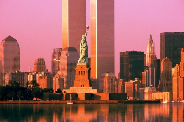
 Today marks the 13th year anniversary of the terrorist attacks on the World Trade Centre in New York. Since the disaster the site has been a hive of activity to change Ground Zero with a striking design that evokes remembrance in the hearts of New Yorkers, whilst exuding power, life and tenacity to the rest of the world.
Last year we saw the grand opening of One World Trade Centre designed by Skidmore, Owings and Merrill. However, the tower’s design is a distant shadow of the original idea drawn out by Daniel Libeskind in 2003 that originally won the hearts of the New Yorkers.
It was Libeskind’s design that generated the nickname of the “The Freedom Tower” with the spire on top of the building reaching high to mirror the Statue of Liberty’s arm. The symbolism of Libeskind’s design recreated the meaning of why the Statue of Liberty was built 238 years ago; Freedom.
His idea was to use the towers height to represent the date in which the 13 states of America became independent from The British Empire in 1776. Therefore, the tower stands at 1776 metres in height and is presently the highest building in the Western Hemisphere.
It stands for everything that America offers citizens within their country; freedom, independence and the living the dream. Libeskind’s idea for the “Freedom Tower” was a softly twisted skyscraper that appeared to be growing out of the ground like the Phoenix rising from the ashes or resembling new growth for the city. The shard like spire at the top of building was the pinnacle of Libeskind's metaphor, pointing high into the sky as if it were a fist punching the air to say, “We did it!”
World Trade Centre 1 opened in September 2013 and bears little resemblance from Libeskind’s original scheme.As with all projects nothing tends to go to plan and Libeskind’s design was changed when David Childs took over as lead architect from Skidmore, Owings and Merrill, whilst Libeskind focused on the overall master plans for the World Trade Centre site.
The flowing spiral design of Libeskind’s tower has been altered for a more angular style with a square shape at the base of the building.
The new “Freedom Tower” has more than symbolism and artistry in its design, it has been modified to ensure the safety of its occupants and the neighbouring city.
For additional safety, the placement of the tower was changed, locating the skyscraper several feet further from the street.
The new tower tries to combine all the functions of a replacement for the buildings that once stood on this site.
Yes it’s modern, yes its safe and it can operate as a commercial space with accessible transportation links, but does it encompass the feelings of people of what there once was?
Does the re-design carry the emotional symbolism so present in the original concept?
Let us know what you think in the comments below.

