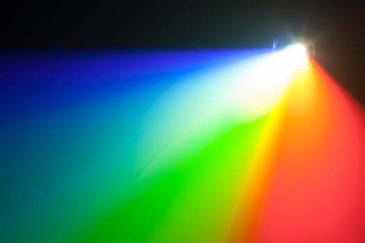
Light and colour go hand in hand. Without light we wouldn’t be able to see any colour. Light is a spectrum of colours that is seen by the naked eye as white light.
Issac Newton’s research and observations helped him to develop this theory of colour for us all to understand. He discovered that a prism will fragment white light into the visible colours forming a spectrum of light.
We all learnt about the spectrum of light in our pre-school days without even thinking about it. The classic song “I can sing a rainbow” has been taught to generations of children for years.
Think back to your younger days and the lyrics,
“Red and yellow and pink and green
Orange and purple and blue
I can sing a rainbow
Sing a rainbow
Sing a rainbow too”.
The song depicts spectral colours which form the spectrum of light. However the spectrum is continuous with further colours that are non-spectral. A non-spectral colour is any colour that is made by mixing grey-scale to another colour, such as white, grey, black.
Because we have colour vision we can distinguish between spectral and non-spectral colours in order to perceive both hue and saturation.
We all need light to survive and for the natural world to grow around us, and it has a major impact on our senses. Colour is created by the absorbtion and reflection of different frequencies of light radiation by the world around us.

Can colour really affect our emotions and behaviour?
Our body’s react to the amount of light that we experience within our environment and it evokes emotional responses through our sense of sight. We perceive colour through one sense alone, sight. Our ability to see in colour produces different psychological effects on the human body.
Research has been conducted to try to understand the physiological effects of colour.
The studies that have been completed have all concluded that different colours can impact us both mentally and physically.
Colours within our environment can change our mood and behaviour.
Research has found that the colour blue has an extremely calming effect that can potentially reduce crime and suicide rates.
Evidence of these findings has been proven in the City of Glasgow where blue street lighting has reduced the levels of crime in certain areas of the city.
The Keihin Electric Express Railway Company in Japan installed blue lighting to the ends of the platforms at Gumyoji Station in Yokohama. As a result no suicide attempts have occurred at this station to date.
So it seems that colour really can provoke an emotional reaction, influencing the way we think and make decisions. Different colours can be used to stimulate and create a variety of reactions.
Let’s try it out with the spectral colours and see how they can affect you. Think of the first emotions that it evokes.
RED

BLUE

YELLOW

GREEN

VIOLET

Ok, let’s see if common research results match your answers.
What did the colours say to you?
RED - Stop, danger, strength, excitement, hunger, stimulation, intensity and aggression.
BLUE – Sky, water, sea, refreshing, clean, coldness, sadness, intelligence or calm.
YELLOW – Sun, warmth, bright, optimism, friendly and happy.
GREEN - Trees, nature, growth, environment, equilibrium, peace, calm.
VIOLET - Luxury, quality, sadness, death, spiritual awareness.
No matter where you look the results will be comparable.
With the results of our short test in mind together with other research findings, can the use colour create a positive teaching space to engage students and promote learning?
Most teachers would probably agree that in the short time they have with pupils it is imperative that their attention is held for the duration of the lesson to maximise learning.
Effective use of colour in the classroom can change the teaching environment from the colour of the furniture to a brightly coloured display board.

Simmons, 1995 has found that,
“Colour in the learning environment should provide an unthreatening environment that improves visual processing, reduces stress, and challenges brain development through visual stimulation, relationships and pattern seeking.
Visual stimulation actually rewires the brain, making stronger connections while fostering visual thinking, problem solving, and creativity”.
As we know children learn through play and by applying this knowledge carefully the learning environment can help promote enjoyment, subsequently encouraging learning and improving the all-important test results
Which colours are best for schools?
The aim of colour in the classroom is to inspire, excite and stimulate the children’s senses so that they are engaged but not distracted. When deciding what colours to use within a teaching space it is important to call upon the psychology of colours to aid with the design process.
Warming colours such as reds, yellows and oranges stimulate the senses, bringing excitement, encouraging aggression and also increasing appetite.
Studies have shown that while red aids focus on detail work, for example mathematics, it also promotes impatience.These colours would be productive for short time spans to draw specific attention, but throughout the duration of a lesson the colours would be distracting and disruptive when trying to settle and calm the pupils.
Cool colours have the opposite effect. Blues, greens, violets and even browns create a relaxing and calming environment.
Appropriate shades of cool colours would help students to concentrate rather than diverting their attention.
However, on the other hand blue also is associated with coldness and if the teaching environment is not sufficiently heated this could eventuate the problematic cool temperature.
Blue is also a proven aid to creative thinking where a broad view of a situation is needed. Perhaps the phrase "blue sky thinking" is quite appropriate?
Adam Alter in his text explains the reason for his book's name "Drunk Tank Pink". In it he describes the findings of a study into a specific colour of pink. They found that this shade of pink had a physical affect on people, reducing their strength while in that environment. It was thereafter used in US naval holding cells, or 'drunk tanks' as they were known.
Everyone reacts differently to the stimulus of colour and there is no one size fits all approach to creating the perfect teaching space.
Consultation in the psychology of colours, consideration of research results and a balanced use of warm and cooling colours, that are soft and bright, can create a balanced pleasing effect to keep pupils focused.
Tell us about your experience with colour in the comments below, and be sure to subscribe in the box to the top right of the page to receive further posts direct to your email.

