In Brief
Client: Quality Print Service
Location: Staffordshire
Completion Date: Summer 2016
Over the past twenty years Quality Print Service (QPS), based in Stoke-on-Trent has grown from strength to strength, investing in the latest technology to propel the business forwards, creating a strong presence in their industry.
For the business to continue to thrive and expand the existing support facilities required modifying and refreshing, to enhance the customer experience that the QPS provides.
The existing building was dark with very little natural light extending throughout the administrative and client-facing areas. The layout also made communication difficult due to inherited office layout over the one floor.
We were appointed by our client, QPS, to redesign, refurbish and refit their existing customer facing administrative facilities to facilitate future business growth.
Their design brief was clear and concise; they wanted an office refurbishment and high specification office fit out that reflected their commercial professionalism, to transform their client-facing areas into light filled spaces to achieve their full potential in terms of its function and client interaction. They wanted their organisation to move towards a more modern and collaborative way of working where people could meet together in a new defined meeting area.
As with any business, time and minimal disturbance was of the essence to QPS. They were extremely eager to get the project started to meet with their impending deadline and determined budget.
QPS required help from our team at Croft Architecture to swiftly and successfully create a design solution that delivers a light functional working space with the capability to grow as the business continues to succeed and expand.
Time was of the essence for QPS and our team at Croft Architecture swiftly and successfully acquired Building Control Approval for their project to progress, ensuring project completion for their new working space in summer 2016.
Our Approach
Upon meeting with the client and surveying the site, we immediately identified that there were existing serious problems with the building that QPS had been inherited from the previous owners. This meant that the entire building was potentially unsafe due to inadequate fire protection and did not comply with Building Regulations.
We now needed to address Building Control aspects in relation to the building in its entirety, as well as focusing on the regulations in relation to the new design for the new office refurbishment and refit.
There were several core objectives to target from our clients brief, but the overarching aim of the whole refurbishment for QPS was to provide essential light filled, modern, client-facing spaces and facilities to develop its current business operations that fully comply with Building Regulations.
QPS take pride in their flexible approach when working with their clients and they’re proud to guarantee a consistent high quality production, with precision and efficiency in all of their work.
It was therefore essential for our design approach to successfully convey QPS’ high quality brand & ethos throughout their office refit, whilst developing a design solution that respects the site and existing building in accordance with Building Regulations.
The business had rapidly grown in size and facilities and they required assistance to find a suitable design solution to maximise the potential for growth within the parameters of the existing building.
Design Approach
We worked closely with our clients to gain a deep understanding of their brief and vision, which allowed us to collaborate and identify a particular style to gravitate towards. We took branding, space utilisation and their daily operations into consideration to construct a design plan that best suited their needs to incorporate into our designs.
Our interactive design approach with the client helped to shape the direction of the projects’ architectural style, scale and massing, creating a design solution to facilitate interactions within an open office culture.
Ground Floor Experience
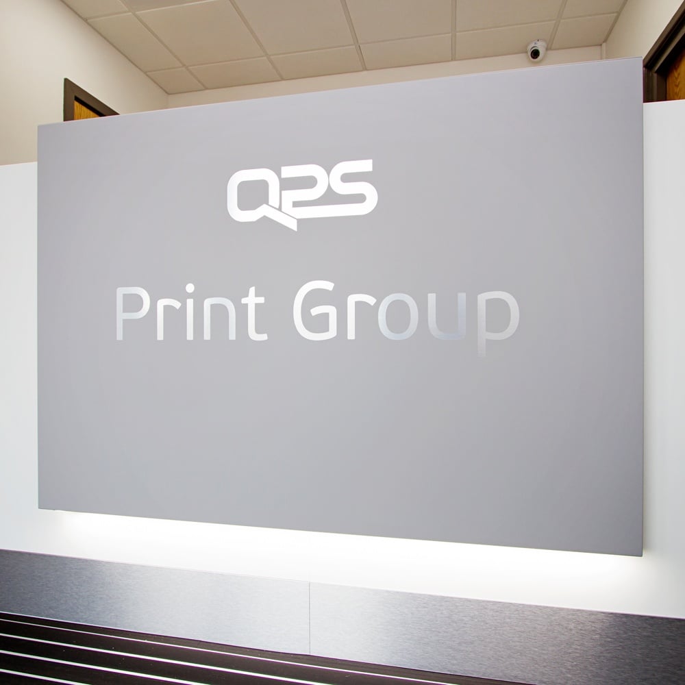
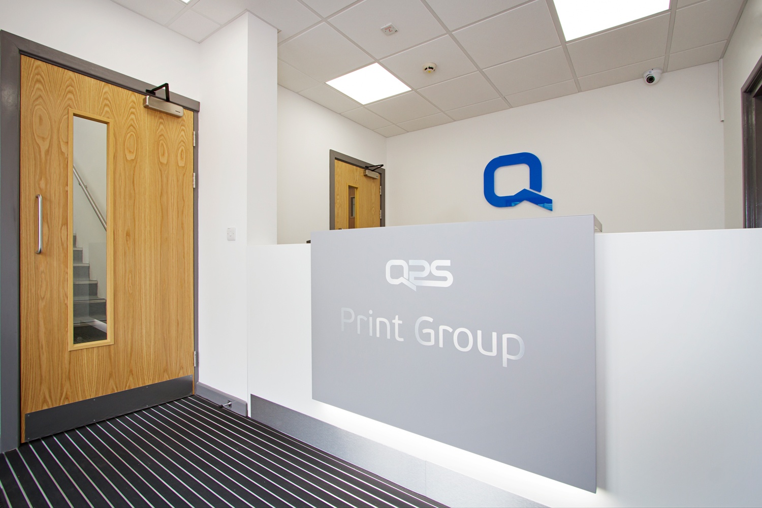
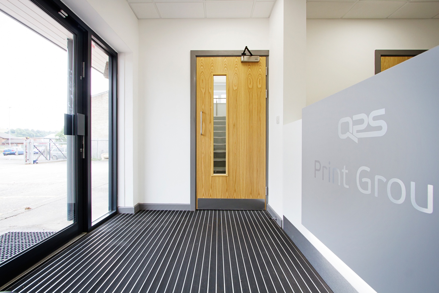
Our team at Croft Architecture have created a light, clean, modern refit. QPS’ clients are now welcomed by a bright, airy, and professional, public downstairs reception space. We’ve incorporated positive messaging throughout the reception space through colour, materials and with on wall graphics supplied by the client. Blue and grey both feature within their brand colours and they play a main role in the accent colours as clients are greeted within the new reception area. We’ve used their secondary colour palette on furniture and finishes to create a sleek and professional look.
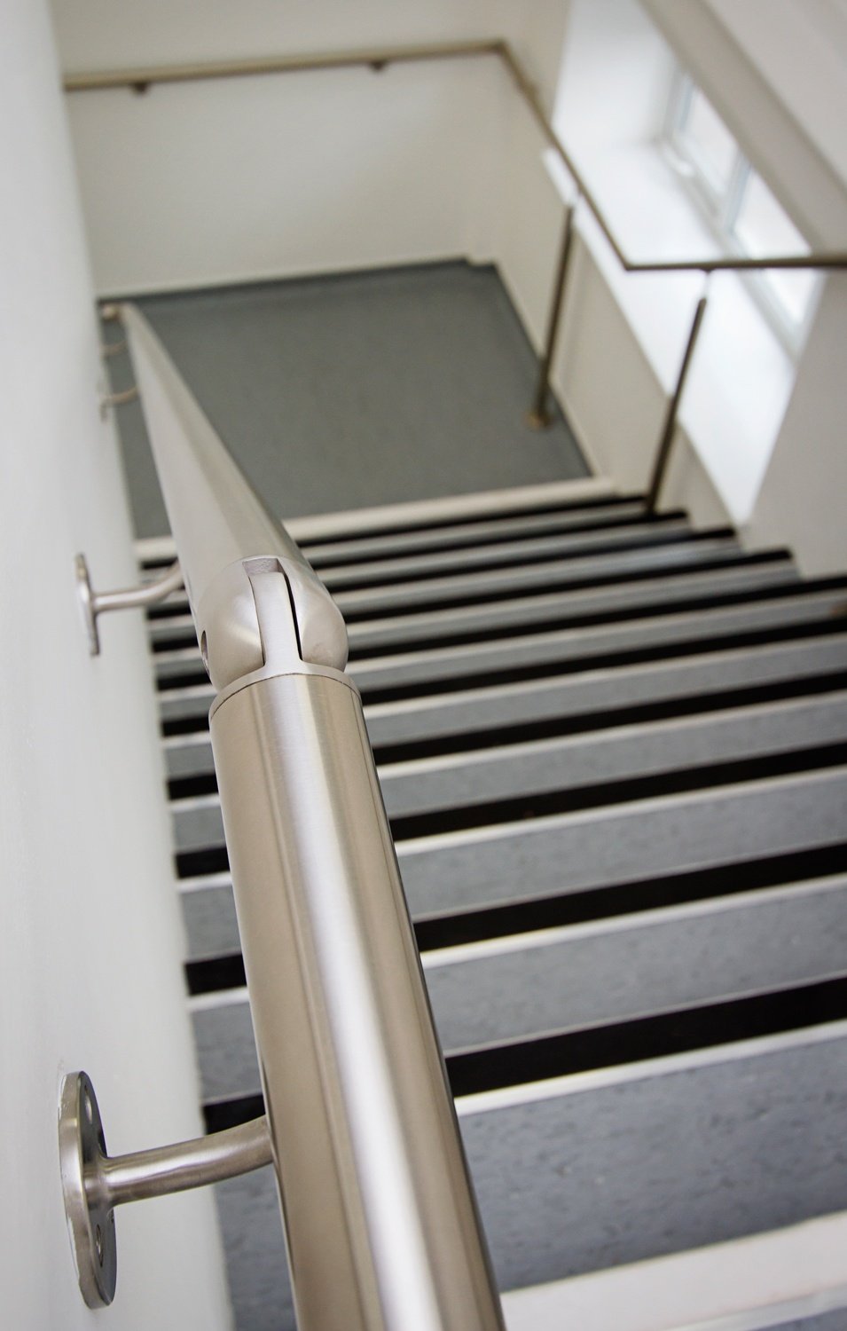
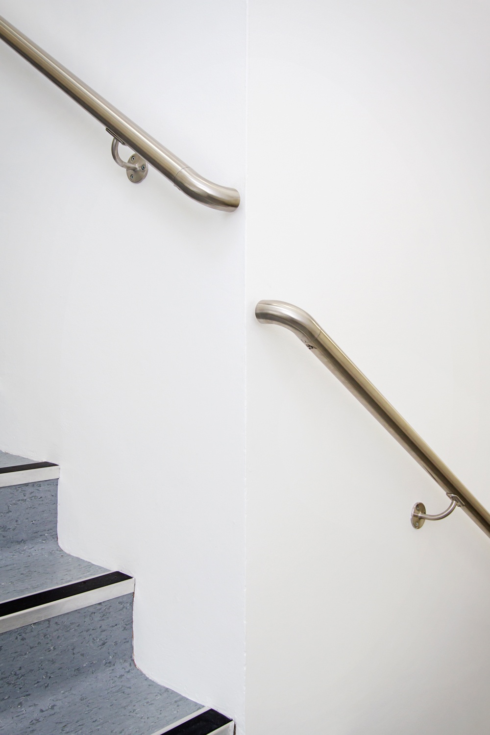
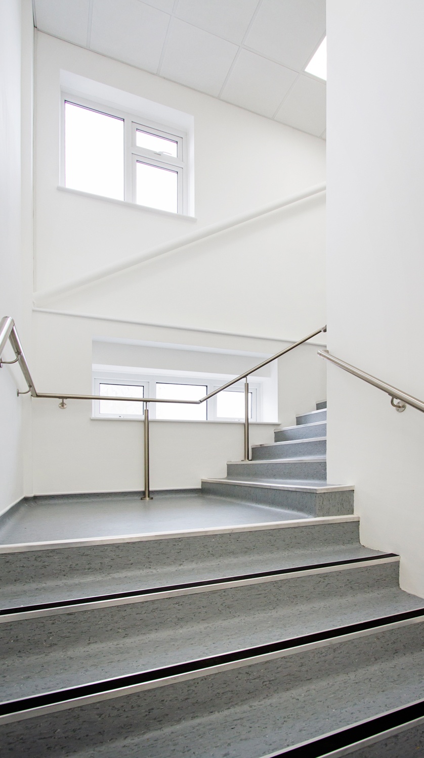
By removing a wall at the top of the public staircase, light now fills the stairway and down into the new reception space. In addition to the new extra amount of natural light, the white painted walls help to reflect of natural light throughout the stairwell, where again clean and modern materials were chosen for their light reflecting properties.
The design from the ground floor reception area seamlessly flows through the stairway to the upstairs office area where the brand colours and materials continue; creating a new open, light filled and spacious office environment for the team.
First Floor Office Space
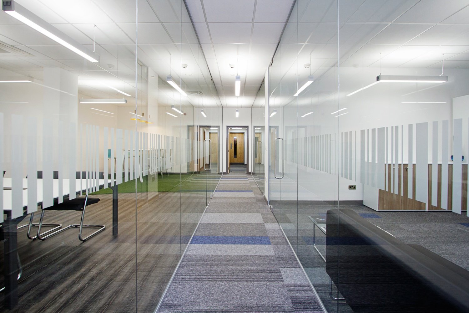
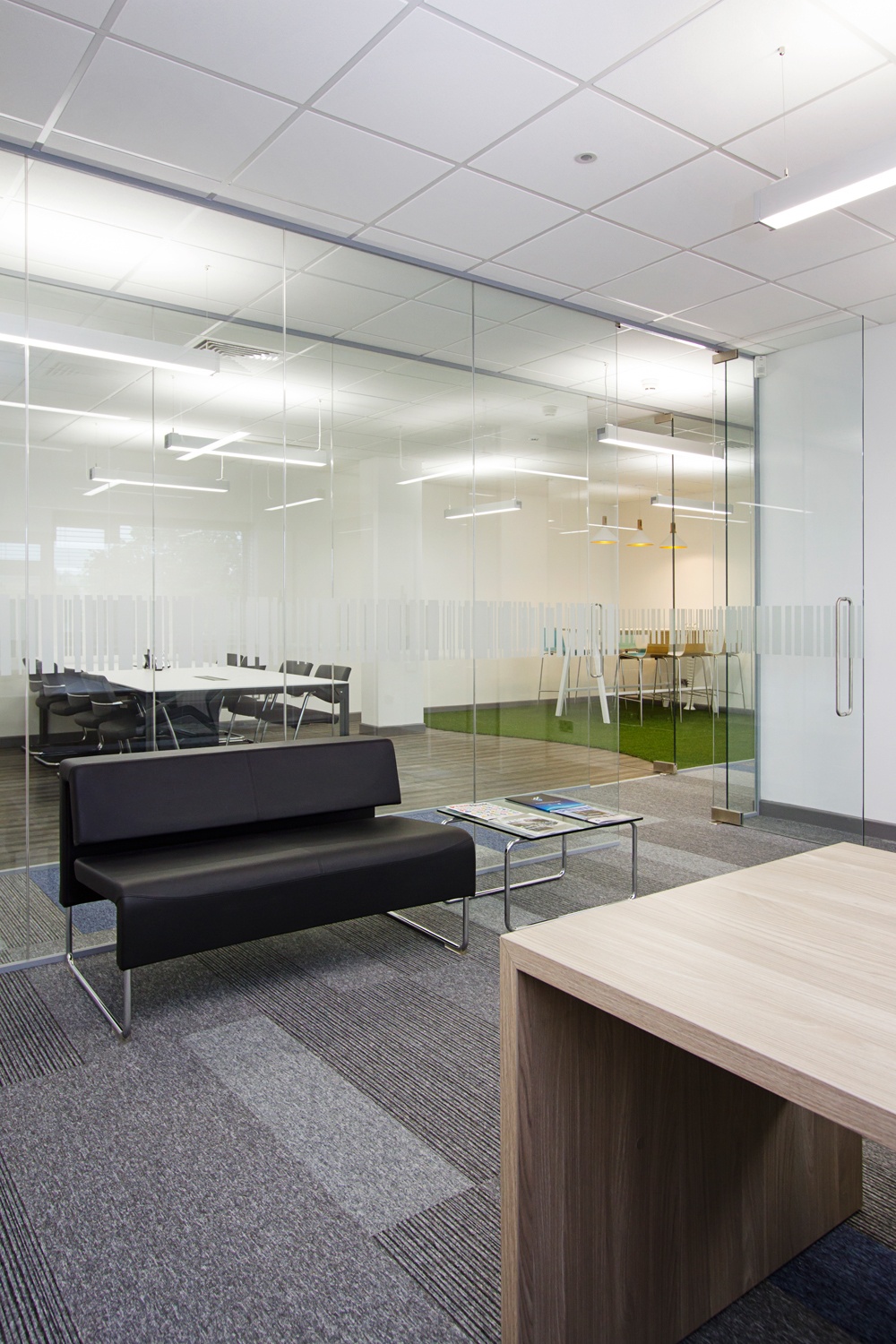
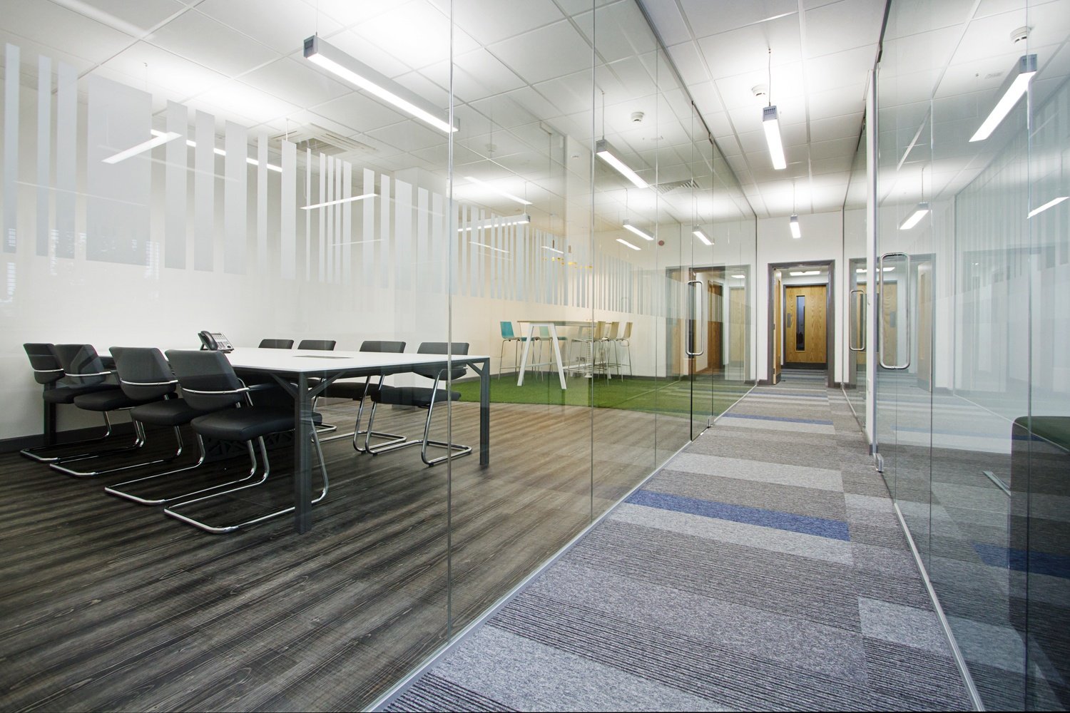
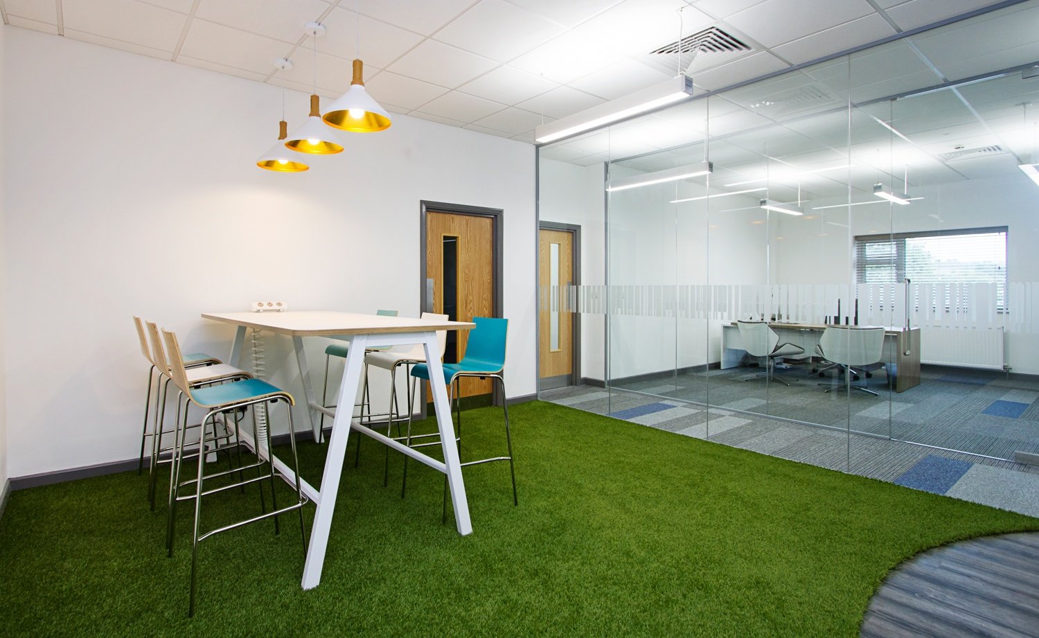
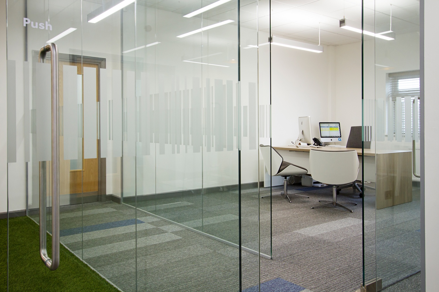
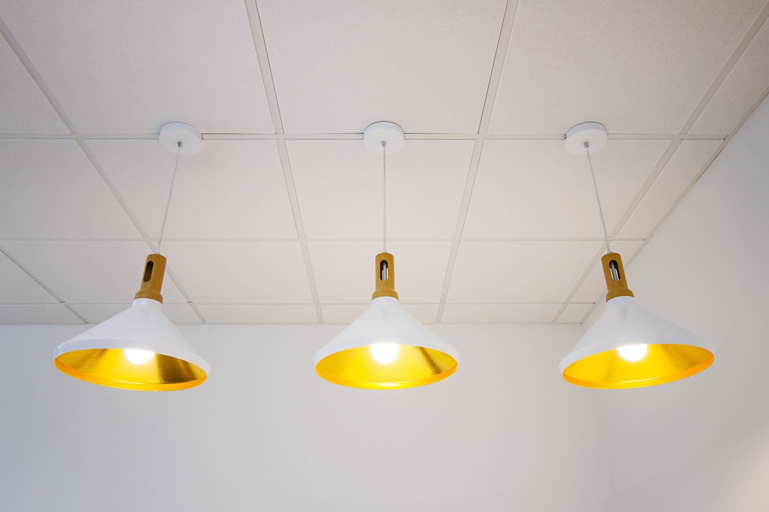
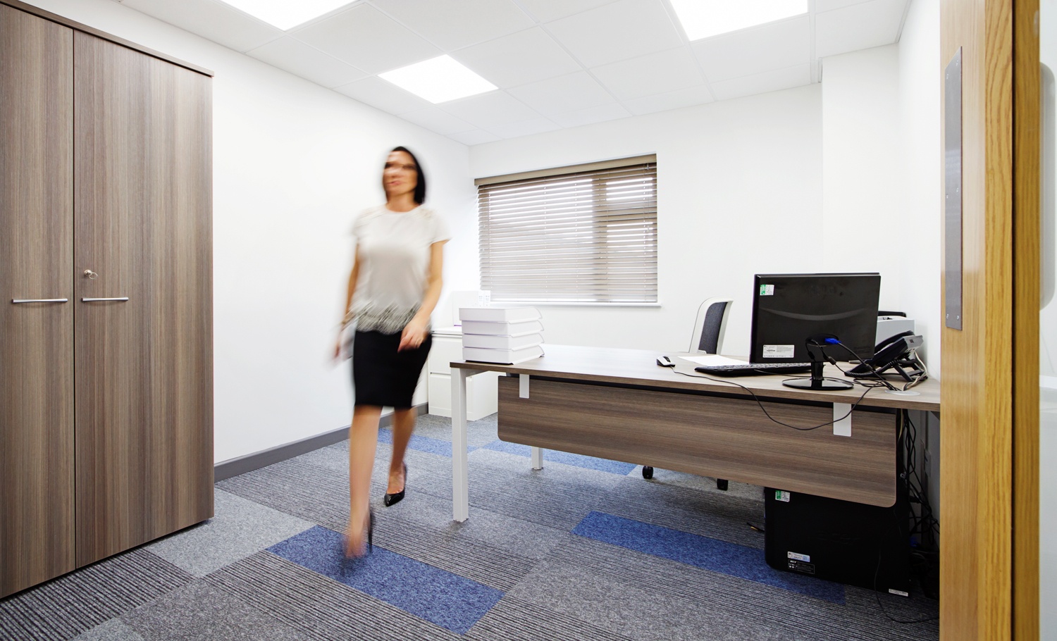
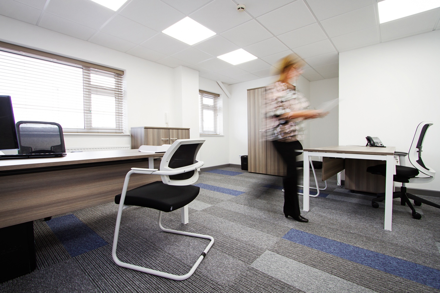
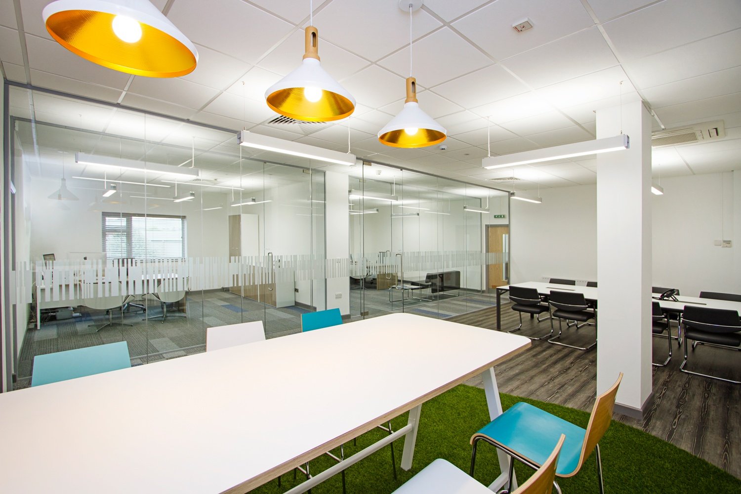
We have created the illusion of an open plan environment by enclosing private office space with a centralised glazed corridor that leads towards an open plan break out area. The area was designed with responsive working in mind, creating formal working areas that closely connect with the open plan meeting spaces and bench desking with the new office environment. The new lighting illuminates the ceiling as well as generating effective task lighting, creating the impression of space throughout the new office environment. New vibrant white ceilings and walls help to reflect both natural and artificial light providing a light, fresh finish with no dark spots.
We have considered the whole building within the new design to upgrade the fire protection throughout their premises including the factory floor areas so that the entire building now fully complies with Building regulations.
The first floor office space has been designed to provide a mixture of spaces where people can collaborate, have private conversations and meetings and get individual work done effectively. The new stud partitions between the offices and open plan areas, not only enhance the acoustic performance, but they also will prevent the spread of fire throughout the building.
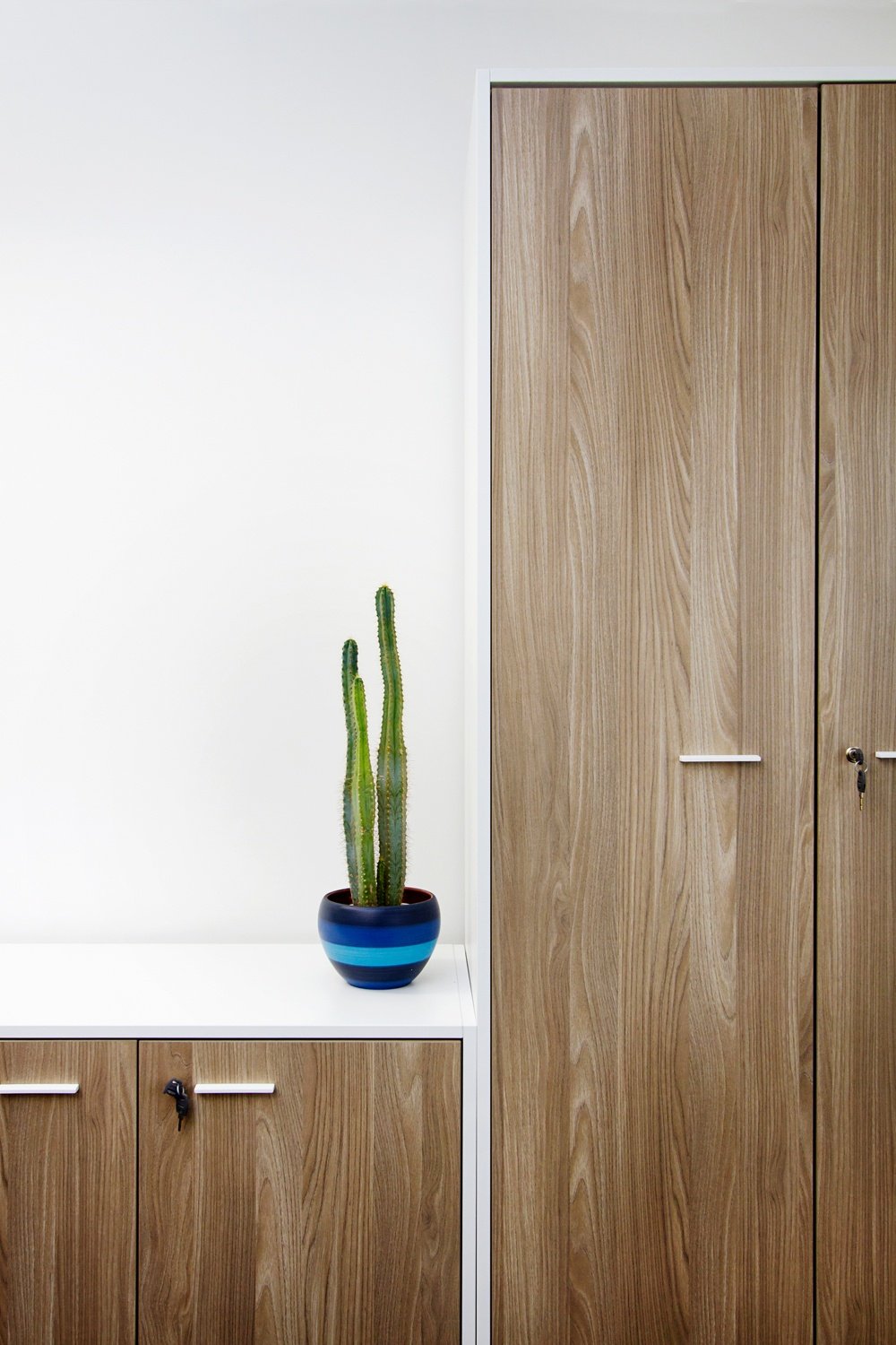
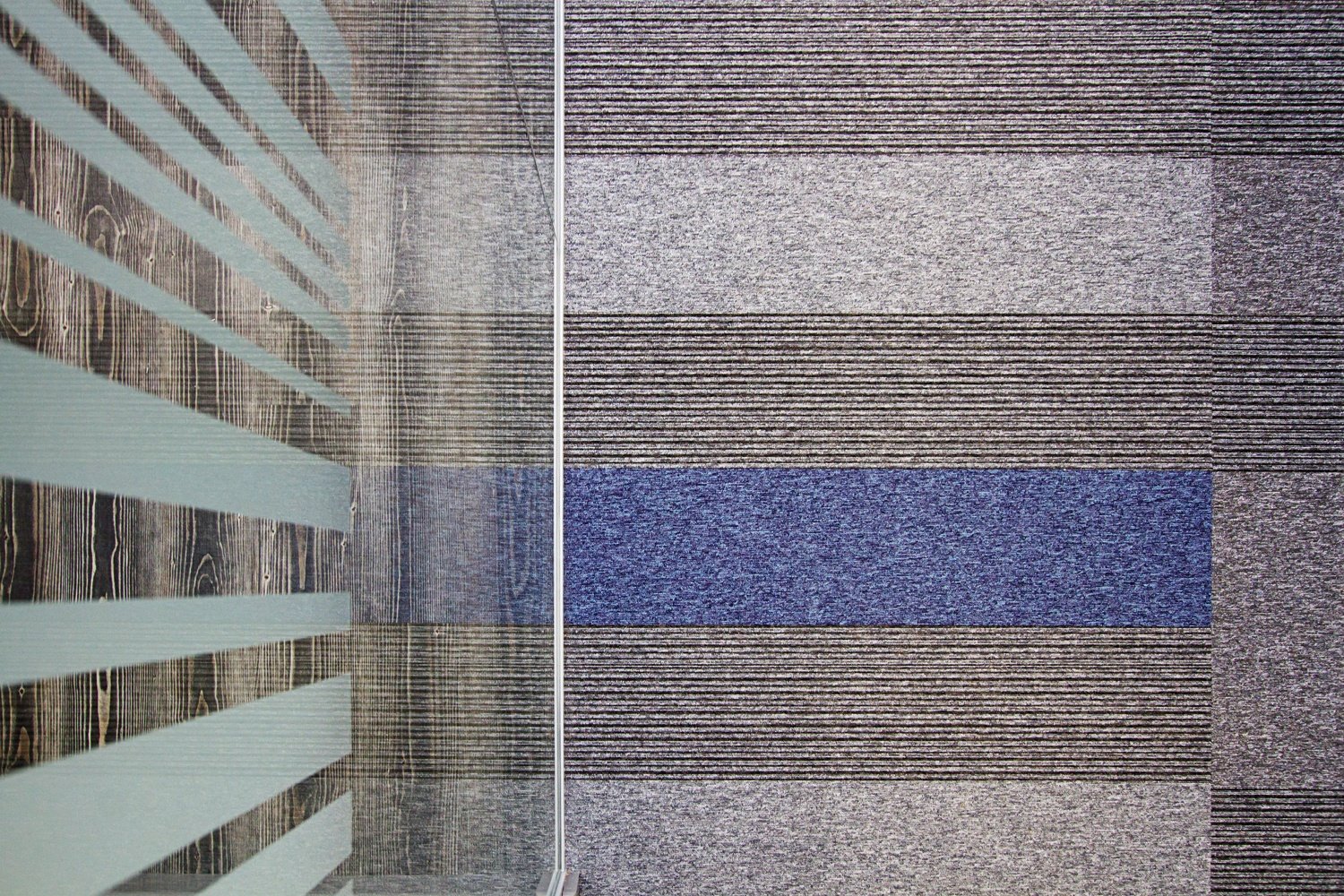
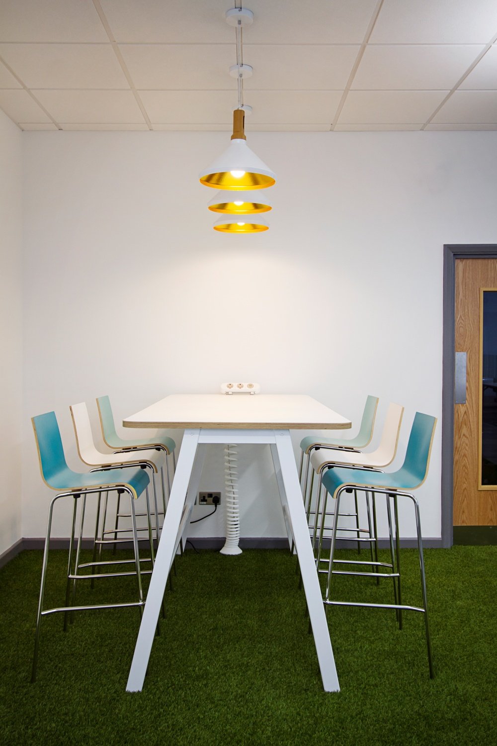
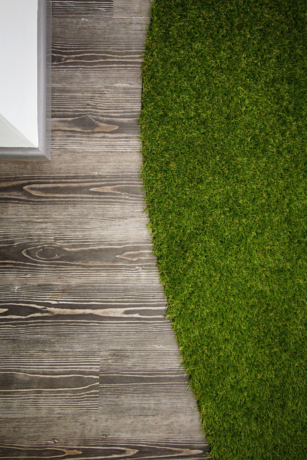
The main design features include the textured carpets that embrace the company’s brand colours, injections of bright blues have been introduced into the furniture, the glazed office frontage and the artificial grass within the break out area. All these features add to their office design vision of creating an inspiring environment for both their clients and their staff. From the glass walled offices to the collaborative breakout spaces, the new areas definitely succeeded in providing working environments to suit a variety of purposes.
As with any project time management and financial control was at the forefront our teams’ project plan and execution. A close collaboration between the client and our team enabled us to successfully deliver a Building Control approved design that is tailored for the client and properly promotes their business.

